194-花花看了一眼,其中就一张不会画
刘小泽写于2020.6.6 偶然在网上看到一个人分享的ggplot2作图技巧:https://cedricscherer.netlify.app/2019/05/17/the-evolution-of-a-ggplot-ep.-1/#data
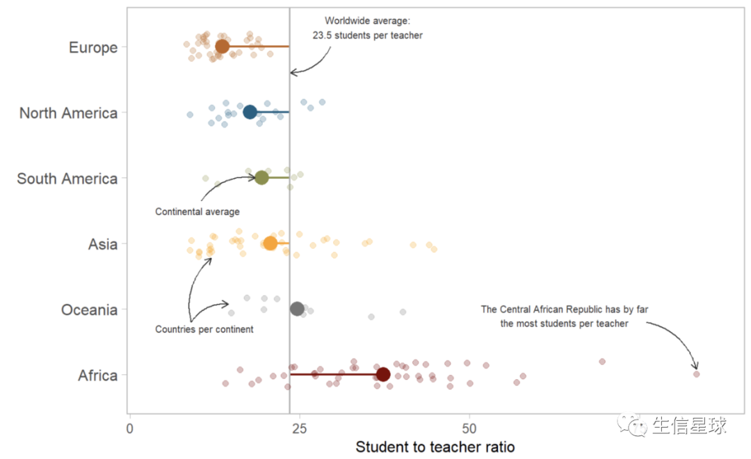
先上图!
上数据!
准备两个文件即可:
- https://raw.githubusercontent.com/rfordatascience/tidytuesday/master/data/2019/2019-05-07/student_teacher_ratio.csv
- https://gist.githubusercontent.com/maartenzam/787498bbc07ae06b637447dbd430ea0a/raw/9a9dafafb44d8990f85243a9c7ca349acd3a0d07/worldtilegrid.csv
然后数据生成脚本在:https://gist.github.com/Z3tt/301bb0c7e3565111770121af2bd60c11
我们主要利用:region和student_ratio 这两列数据,并根据student_ratio得到中位数student_ratio_region
画图
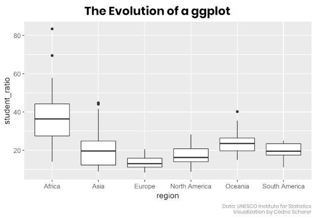
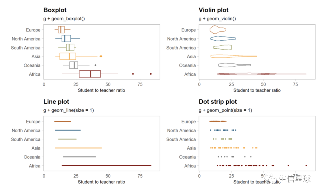
图一:最简单的箱线图
library(tidyverse)

ggplot(df_ratios, aes(x = region, y = student_ratio)) +
  geom_boxplot()
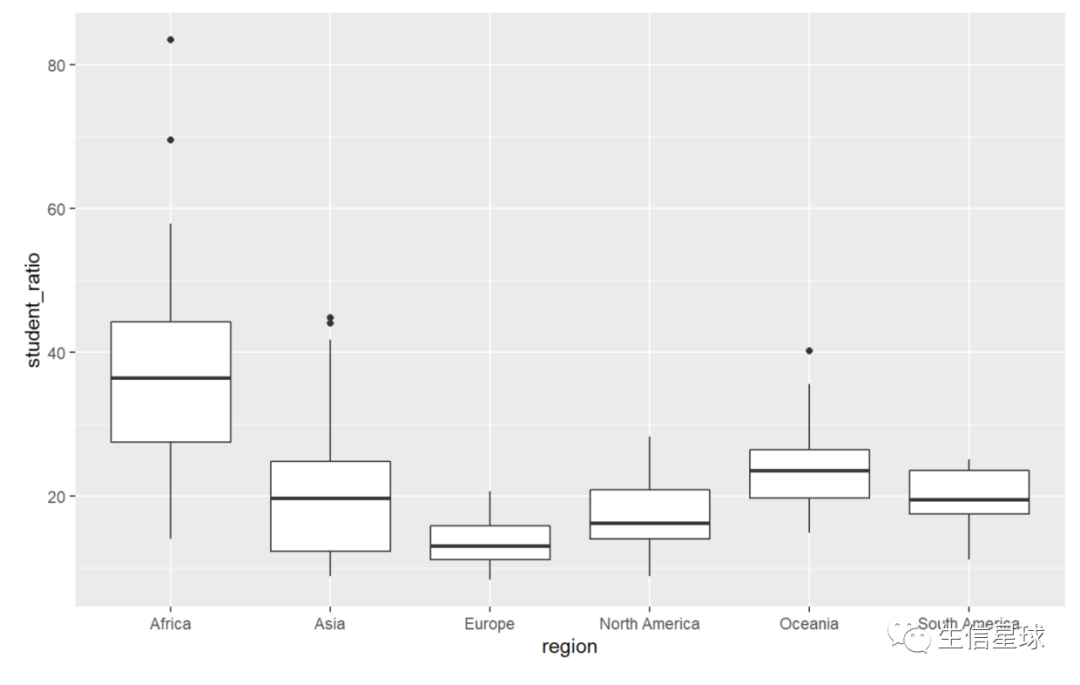
图二:将中位数降序排列
也就是把student_ratio_region降序
df_sorted <- df_ratios %>%
  mutate(region = fct_reorder(region, -student_ratio_region))

ggplot(df_sorted, aes(x = region, y = student_ratio)) +
  geom_boxplot()

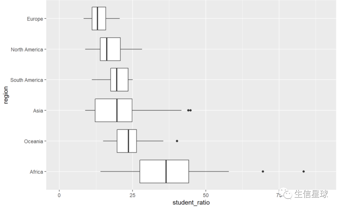
图三:将x、y轴翻转,并在坐标轴上加上0 => coord_flip
看到之前的y轴没有起始坐标,于是可以人为定义
ggplot(df_sorted, aes(x = region, y = student_ratio)) +
  geom_boxplot() +
  coord_flip() +
  scale_y_continuous(limits = c(0, 90))
图四:自定义设置主题 => 全局theme_set/ 局部theme
theme_set(theme_light(base_size = 15, base_family = "Arial"))
这个主题是全局设置的,以后画的各种图都是theme_light形式,除非自己再特定修改某个图的主题,例如下面增加主题设置:
# 把数据先做成一个gg对象,之后画各种图都是在这个对象的基础上
g <- ggplot(df_sorted, aes(x = region, y = student_ratio, color = region)) +
    coord_flip() +
    scale_y_continuous(limits = c(0, 90), expand = c(0.005, 0.005)) +
    scale_color_uchicago() + # ggsci包的配色方案
    labs(x = NULL, y = "Student to teacher ratio") +
    theme(legend.position = "none",
          axis.title = element_text(family = "Times New Roman",size = 12), # 特定设置文体格式
          axis.text.x = element_text(family = "Times New Roman", size = 10),
          panel.grid = element_blank())
能清楚看到,设置后y轴是一种字体(theme_set设置的),x轴axis.text.x和整图的标题axis.title是另一种字体【这里只作为解释,后面还是使用统一的Arial字体】

现在看上去是空白,其实数据已经存到对象中了,我们要做的就是把数据映射到某种类型的可视化中(比如箱线图、散点图等)
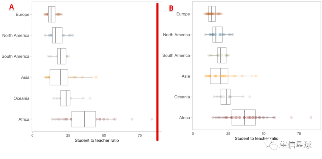
图五:设置透明 => alpha
g + geom_point(size = 3, alpha = 0.15)

图六:图形叠加
比如要在上面散点图的基础上,增加箱线图,并且去掉离群点
【注意观察:下面两行的不同】
一个是先画点图,一个是先画箱线图。可以看到图B是我们更想看到的,因为ggplot2是图层叠加,先画的放在下面,于是先画箱线图
# A
g + geom_point(size = 3, alpha = 0.15)+
    geom_boxplot(color = "gray60", outlier.alpha = 0)
# B
g + geom_boxplot(color = "gray60", outlier.alpha = 0) +
    geom_point(size = 3, alpha = 0.15)
# outlier.alpha = 0设置比较巧妙,如果存在离群点,就设置透明度为0,也就是看不到了;另外,还可以通过设置形状:outlier.shape = NA 来去除
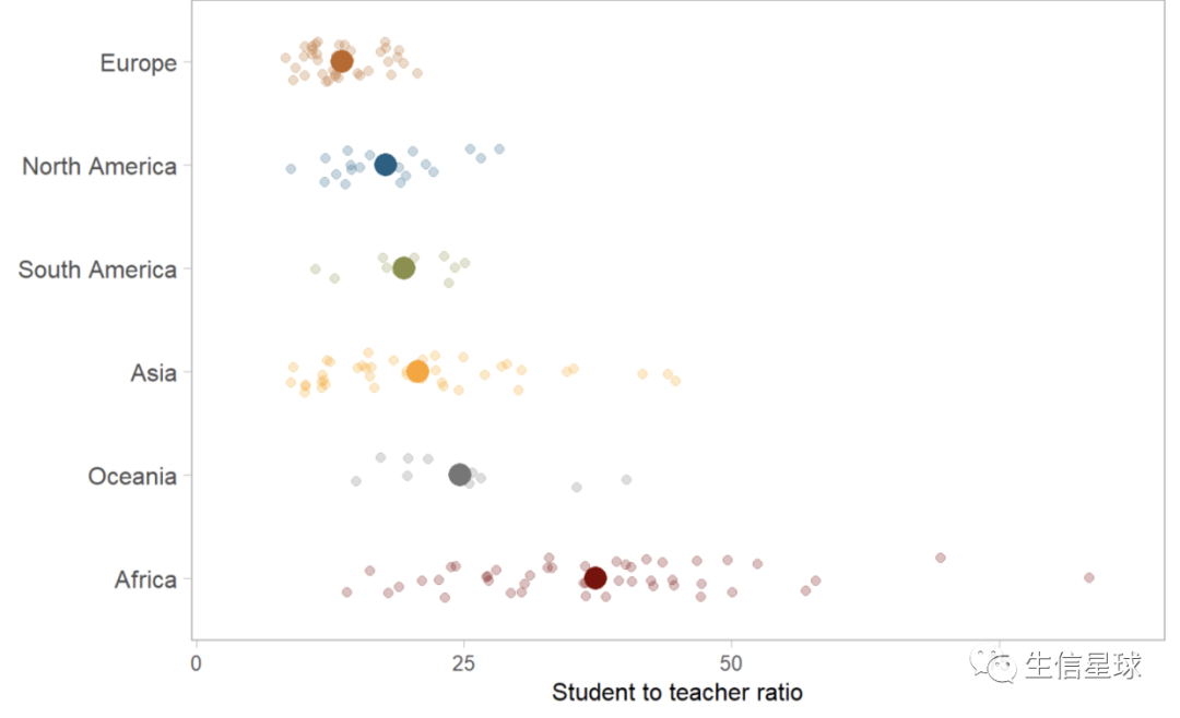
图七:如何让散点真的散开 => geom_jitter
之前的散点图还是存在点的重叠,如果要分开,就要添加“抖动(jitter)”
set.seed(123) # 这个添加抖动是随机的,因此需要设置随机种子
g + geom_jitter(size = 2, alpha = 0.25, width = 0.2) #width参数可以自己修改看看变化

图八:在散点图上添加统计结果 => stat_summary
比如添加均值(以点显示)
g +
  geom_jitter(size = 2, alpha = 0.25, width = 0.2) +
  stat_summary(fun.y = mean, geom = "point", size = 5)
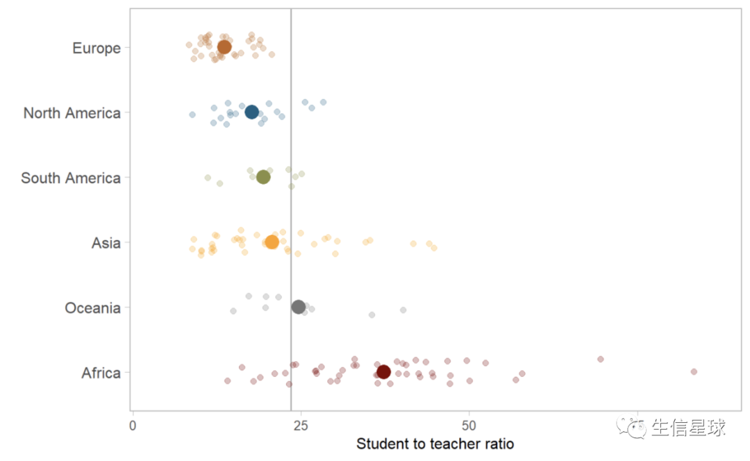
每个组添加完均值后,再添加一个整体的均值(用一条线表示)
# 求出整体的均值
world_avg <- df_ratios %>%
  summarize(avg = mean(student_ratio, na.rm = T)) %>%
  pull(avg)

# 加一条竖线
g +
  geom_hline(aes(yintercept = world_avg), color = "gray70", size = 0.6) +
  stat_summary(fun.y = mean, geom = "point", size = 5) +
  geom_jitter(size = 2, alpha = 0.25, width = 0.2)
将每组的均值与整体均连接起来 => geom_segment (segment表示线段)
g +
    geom_jitter(size = 2, alpha = 0.25, width = 0.2) +
    stat_summary(fun.y = mean, geom = "point", size = 5)+
    geom_hline(aes(yintercept = world_avg), color = "gray70", size = 0.6)+
    geom_segment(aes(x = region, xend = region,
                     y = world_avg, yend = student_ratio_region),
                 size = 0.8)
从上面geom_segment代码就能看到,分别设置了起始和终止。另外这里的x不是指横坐标,而是指当时生成gg对象时设置的x(即region)【如下图】

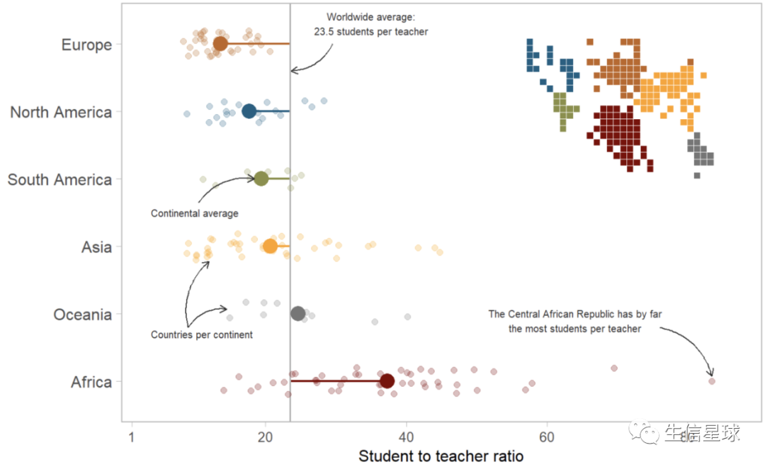
图九:添加文字 => annotate
可以设置文字内容、位置、字体、字号、颜色
g_text = g +
    geom_jitter(size = 2, alpha = 0.25, width = 0.2) +
    stat_summary(fun.y = mean, geom = "point", size = 5)+
    geom_hline(aes(yintercept = world_avg), color = "gray70", size = 0.6)+
    geom_segment(aes(x = region, xend = region,
                     y = world_avg, yend = student_ratio_region),
                 size = 0.8) +
    annotate("text", x = 6.3, y = 35, family = "Arial", size = 2.7, color = "gray20",
             label = paste0("Worldwide average:\n",round(world_avg, 1)," students per teacher")) +
    annotate("text", x = 3.5, y = 10, family = "Arial", size = 2.7, color = "gray20",
             label = "Continental average") +
    annotate("text", x = 1.7, y = 11, family = "Arial", size = 2.7, color = "gray20",
             label = "Countries per continent") +
    annotate("text", x = 1.9, y = 64, family = "Arial", size = 2.7, color = "gray20",
             label = "The Central African Republic has by far\nthe most students per teacher")

图十:添加箭头 => geom_curve
这个过程需要不断调整,如果嫌麻烦可以后期自己加上
分别设定箭头的起始(x、y)和终止(xend、yend),以及曲率curvature
arrows <- tibble(
  x1 = c(6, 3.65, 1.8, 1.8, 1.8),
  x2 = c(5.6, 4, 2.07, 2.78, 1.08),
  y1 = c(world_avg + 6, 10.5, 9, 9, 76),
  y2 = c(world_avg + 0.1, 18.4, 14.48, 12, 83.41195)
)

(g_arrows <- g_text +
  geom_curve(data = arrows, aes(x = x1, y = y1, xend = x2, yend = y2),
             arrow = arrow(length = unit(0.08, "inch")), size = 0.5,
             color = "gray20", curvature = -0.3))
图十一:马赛克图 => geom_tile
感觉会了这个图,就会了乐高拼图 除了知道使用geom_tile,还要设置合适的背景才能出来效果
# 如果只用简单的geom_tile
df_sorted %>%
        ggplot(aes(x = x, y = y, fill = region, color = region)) +
        geom_tile(color = "white")

# 还需要做:
# 1.将纵坐标降序排列:scale_y_reverse()
# 2.配色:scale_fill_uchicago(guide = F)
# 3. 确保两个轴上相等的长度表示相同的单位变化:coord_equal()
# 4. 设置各种透明背景:theme()
(map_regions <- df_sorted %>%
  ggplot(aes(x = x, y = y, fill = region, color = region)) +
    geom_tile(color = "white") +
    scale_y_reverse() +
    scale_fill_uchicago(guide = F) +
    coord_equal() +
    theme(line = element_blank(),
          panel.background = element_rect(fill = "transparent"),
          plot.background = element_rect(fill = "transparent",
                                         color = "transparent"),
          panel.border = element_rect(color = "transparent"),
          strip.background = element_rect(color = "gray20"),
          axis.text = element_blank(),
          plot.margin = margin(0, 0, 0, 0)) +
    labs(x = NULL, y = NULL))
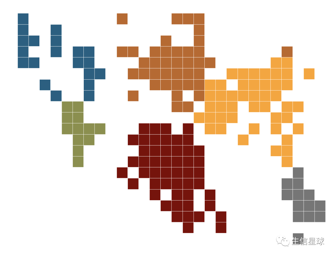
最后
如果要把马赛克图加到原来的图中
g_arrows +
  annotation_custom(ggplotGrob(map_regions), xmin = 2.5, xmax = 7.5, ymin = 55, ymax = 85)