195-ComplexHeatmap的简单使用
刘小泽写于2020.6.8 从https://github.com/kevinblighe/E-MTAB-6141这里看到一个画热图的文档,写的还很详细,和你分享 更多的热图绘制使用可以看:https://www.datanovia.com/en/lessons/heatmap-in-r-static-and-interactive-visualization/
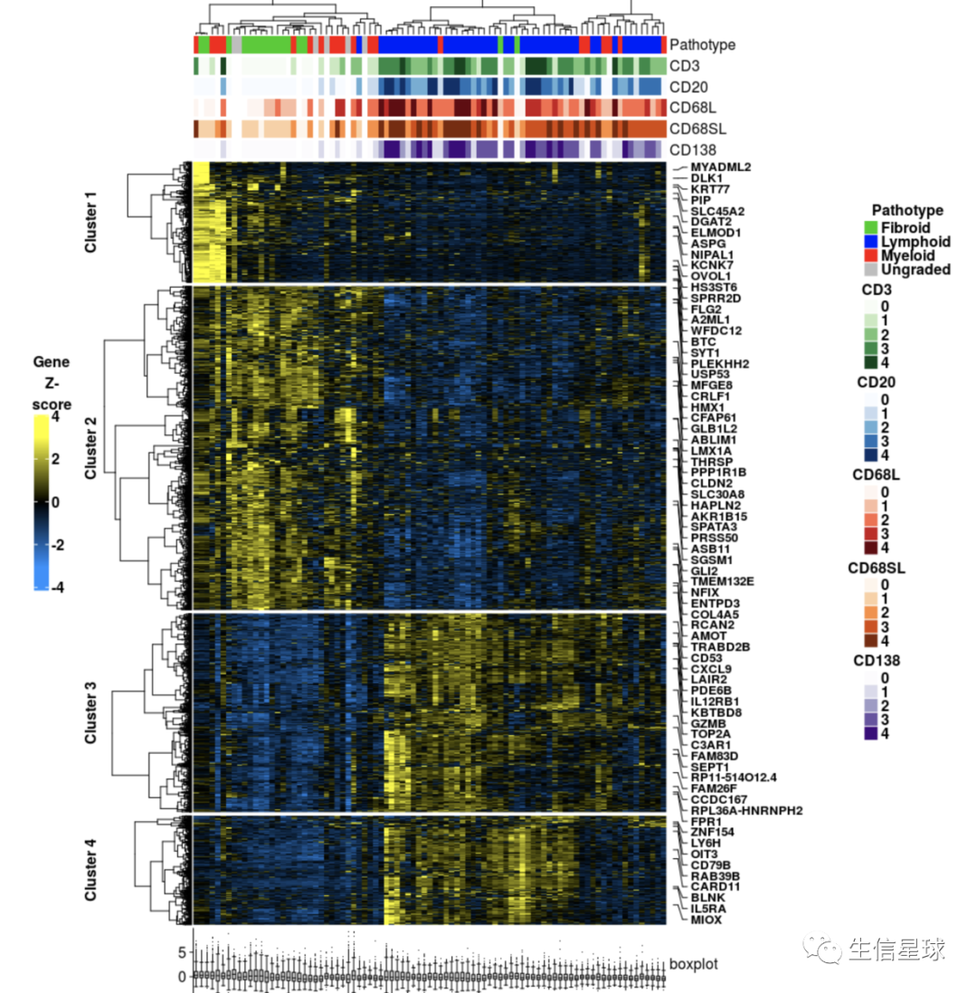
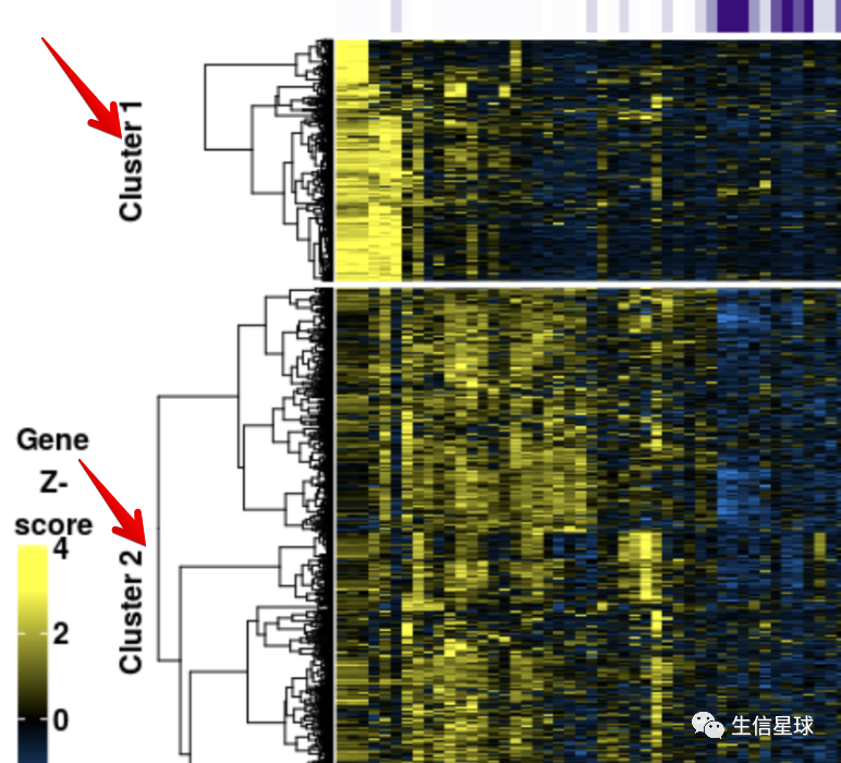
上图!
乍一看,应该有成百上千行,几十列,然后进行了行的z-score,并划分了4个cluster;行标注了一些基因名,列进行了注释。最后根据每个列做了boxplot
需要准备的包
  require(RColorBrewer)
  require(ComplexHeatmap)
  require(circlize)
  require(digest)
  require(cluster)
数据准备
- https://github.com/kevinblighe/E-MTAB-6141/raw/master/rdata/mat.tsv
- https://github.com/kevinblighe/E-MTAB-6141/raw/master/rdata/metadata.tsv
- https://github.com/kevinblighe/E-MTAB-6141/raw/master/rdata/sig_genes.list
mat <- read.table('mat.tsv', sep = '\t', row.names = 1,header = T)
metadata <- read.table('metadata.tsv', sep = '\t', row.names = 1,header = T)
sig_genes <- read.table('sig_genes.list', sep = '\t',header = F)[,1]
# 检查数据完整性(校验md5文件,了解即可)
digest::digest(mat, algo = 'md5')
看一眼数据
> dim(mat);dim(metadata);length(sig_genes)
[1] 19279    87
[1] 87  6
[1] 2772

> mat[1:4,1:4]
      SAM9103802 SAM9103803 SAM9103804 SAM9103805
A1BG   0.1288745  0.1637147 -0.1106011 -0.1113405
A1CF   1.4491133  1.6378292  1.4676648  1.5119170
A2M   15.0932787 14.8324464 14.7205315 14.6949978
A2ML1  3.4826292  3.7443431  4.4786253  3.1842529

> metadata[1:4,1:4]
           Pathotype CD3 CD20 CD68L
SAM9103802  Lymphoid   2    3     1
SAM9103803  Lymphoid   3    4     4
SAM9103804   Myeloid   3    0     0
SAM9103805  Lymphoid   2    2     3

> head(sig_genes)
[1] "A2ML1"      "AADACL2"    "ABCA10"     "ABCA12"     "AC010646.3" "ACACB"

> identical(colnames(mat),rownames(metadata))
[1] TRUE
挑出sig_genes的小表达矩阵
expr <- mat[sig_genes,]
数据处理
按行进行标准化
heat <- t(scale(t(mat)))
> range(heat)
[1] -3.746329  9.218387
设置颜色
颜色这里需要注意:
对离散型数据,color可以是一个向量,简单指定几个颜色即可
但大多数热图都是基于表达矩阵,是连续型数据,需要用颜色映射函数生成(这里用circlize包中的colorRamp2 函数)
# 构建颜色转变函数,数值将按照线性转变为对应的颜色,这里seq设置z-score显示-3到3的颜色
myBreaks <- seq(-3, 3, length.out = 100)
myCol <- colorRampPalette(c('dodgerblue', 'black', 'yellow'))(100)
col = colorRamp2(myBreaks, myCol)
设置每个样本的列注释
也就是利用metadata的信息,注意其中有NA,因此需要先去掉,再赋予颜色
> metadata[1:6,1:4]
           Pathotype CD3 CD20 CD68L
SAM9103802  Lymphoid   2    3     1
SAM9103803  Lymphoid   3    4     4
SAM9103804   Myeloid   3    0     0
SAM9103805  Lymphoid   2    2     3
SAM9103806   Fibroid   0    0     0
SAM9103807   Fibroid   0    0    NA

# 以其中的CD3为例
cd3 <- metadata$CD3
cd3 <- cd3[!is.na(cd3)]
length(unique(cd3)) #5
# 可以设置一个主色(比如绿色),然后从中挑出对应的颜色
pick.col <- brewer.pal(9, 'Greens') # allowed maximum for palette Greens is 9
col.cd3 <- colorRampPalette(pick.col)(length(unique(cd3)))
同理得到其他几种注释的颜色对应关系:
 # CD20
    cd20 <- metadata$CD20
    cd20 <- cd20[!is.na(cd20)]
    pick.col <- brewer.pal(9, 'Blues')
    col.cd20 <- colorRampPalette(pick.col)(length(unique(cd20)))

  # CD68L
    cd68L <- metadata$CD68L
    cd68L <- cd68L[!is.na(cd68L)]
    pick.col <- brewer.pal(9, 'Reds')
    col.cd68L <- colorRampPalette(pick.col)(length(unique(cd68L)))

  # CD68SL
    cd68SL <- metadata$CD68SL
    cd68SL <- cd68L[!is.na(cd68L)]
    pick.col <- brewer.pal(9, 'Oranges')
    col.cd68SL <- colorRampPalette(pick.col)(length(unique(cd68SL)))

  # CD138
    cd138 <- metadata$CD138
    cd138 <- cd138[!is.na(cd138)]
    pick.col <- brewer.pal(9, 'Purples')
    col.cd138 <- colorRampPalette(pick.col)(length(unique(cd68SL)))
生成注释对象
画图的逻辑就是:每一小部分先绘制,最后再拼凑摆放。每一部分都是独立的 注释分为列和行的注释,一般列是要展示这个样本属于哪个分组,行是要标注基因名
常规的列注释
得到这个:(和pheatmap的annotation_col参数类似)

需要一个样本信息的数据框,一个颜色的列表
# 首先得到样本信息数据框
ann <- data.frame(
    Pathotype = metadata$Pathotype,
    CD3 = metadata$CD3,
    CD20 = metadata$CD20,
    CD68L = metadata$CD68L,
    CD68SL = metadata$CD68SL,
    CD138 = metadata$CD138)

> head(ann,3)
  Pathotype CD3 CD20 CD68L CD68SL CD138
1  Lymphoid   2    3     1      3     3
2  Lymphoid   3    4     4      3     3
3   Myeloid   3    0     0      4     0

# 然后是颜色列表
names(col.cd3)=as.character(0:4)
names(col.cd20)=as.character(0:4)
names(col.cd68L)=as.character(0:4)
names(col.cd68SL)=as.character(0:4)
names(col.cd138)=as.character(0:4)

colors=list(Pathotype = c('Lymphoid' = 'blue', 'Myeloid' = 'red', 'Fibroid' = 'green3', 'Ungraded' = 'grey'),
            CD3=col.cd3,
            CD20=col.cd20,
            CD68L=col.cd68L,
            CD68SL=col.cd68SL,
            CD138=col.cd138)
最后用HeatmapAnnotation得到注释对象
colAnn <- HeatmapAnnotation(
    df = ann,
    col = colours,
    which = 'col', # set 'col' (samples) or 'row' (gene) annotation
    na_col = 'white', # NA颜色,默认白色
    annotation_height = 0.6,
    annotation_width = unit(1, 'cm'),
    gap = unit(1, 'mm'),
    # 下面这个都是类似的设置:占几行、标题、字体等
    annotation_legend_param = list(
        Pathotype = list(
            nrow = 4, # 这个legend显示几行
            title = 'Pathotype',
            title_position = 'topcenter',
            legend_direction = 'vertical',
            title_gp = gpar(fontsize = 12, fontface = 'bold'),
            labels_gp = gpar(fontsize = 12, fontface = 'bold')),
        CD3 = list(
            nrow = 5,
            title = 'CD3',
            title_position = 'topcenter',
            legend_direction = 'vertical',
            title_gp = gpar(fontsize = 12, fontface = 'bold'),
            labels_gp = gpar(fontsize = 12, fontface = 'bold')),
        CD20 = list(
            nrow = 5,
            title = 'CD20',
            title_position = 'topcenter',
            legend_direction = 'vertical',
            title_gp = gpar(fontsize = 12, fontface = 'bold'),
            labels_gp = gpar(fontsize = 12, fontface = 'bold')),
        CD68L = list(
            nrow = 5,
            title = 'CD68L',
            title_position = 'topcenter',
            legend_direction = 'vertical',
            title_gp = gpar(fontsize = 12, fontface = 'bold'),
            labels_gp = gpar(fontsize = 12, fontface = 'bold')),
        CD68SL = list(
            nrow = 5,
            title = 'CD68SL',
            title_position = 'topcenter',
            legend_direction = 'vertical',
            title_gp = gpar(fontsize = 12, fontface = 'bold'),
            labels_gp = gpar(fontsize = 12, fontface = 'bold')),
        CD138 = list(
            nrow = 5,
            title = 'CD138',
            title_position = 'topcenter',
            legend_direction = 'vertical',
            title_gp = gpar(fontsize = 12, fontface = 'bold'),
            labels_gp = gpar(fontsize = 12, fontface = 'bold'))))
列的图形注释
比如根据列的信息画一个对应的箱线图:

# 利用anno_boxplot
boxplotCol <- HeatmapAnnotation(
    boxplot = anno_boxplot(
      heat,
      border = FALSE,
      gp = gpar(fill = '#CCCCCC'),
      pch = '.',
      size = unit(2, 'mm'),
      axis = TRUE,
      axis_param = list(
        gp = gpar(fontsize = 12),
        side = 'left')),
      annotation_width = unit(c(2.0), 'cm'),
      which = 'col')
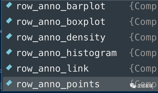
可以看到,除以以外,还有对行的图形注释以及多种图形
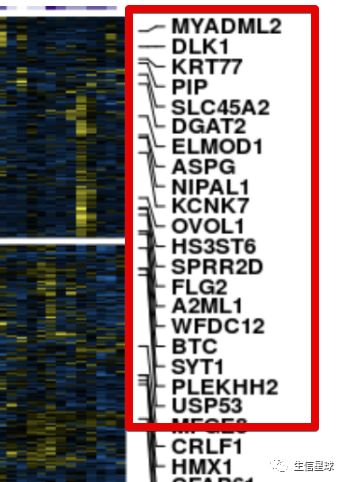
行的基因名注释
目标是得到:
> dim(heat)
[1] 2772   87
# 我们这个作图数据包括了2772个基因名,要全部显示肯定不靠谱。这里的方案是每隔40个取一个基因名,当然如果自己想要特定显示基因名也可以,只要把该基因名在全部基因名中所在的位置拿到就行,赋给参数at即可,然后labels是名称
genelabels <- rowAnnotation(
    Genes = anno_mark(
      at = seq(1, nrow(heat), 40),
      labels = rownames(heat)[seq(1, nrow(heat), 40)],
      labels_gp = gpar(fontsize = 5, fontface = 'bold'),
      padding = 0.75),
      width = unit(2.0, 'cm') +

      max_text_width(
        rownames(heat)[seq(1, nrow(heat), 40)],
        gp = gpar(fontsize = 5,  fontface = 'bold')))
对行进行分群
目标是得到不同的cluster:
聚类的方法有很多,可以用hclust的层次聚类,也可以用 PAM算法(Partitioning Around Medoid, 围绕中心点的划分),也可以用kmeans
# hclust聚类
hc=hclust(dist(heat))
hc_result=cutree(hc, 4)
# pam聚类
pamClusters=cluster::pam(heat, k = 4)
pam_result=pamClusters$clustering
# kmeans聚类
kmeans_result=kmeans(heat,centers = 4)$cluster

> table(hc_result,pam_result)
         pam_result
hc_result   1   2   3   4
        1 311 268   0   2
        2 132 922   0   0
        3   0   3 575 312
        4   2   0 157  88

> table(pam_result,kmeans_result)
          kmeans_result
pam_result    1    2    3    4
         1   32    0    1  412
         2 1189    0    0    4
         3    1  167  564    0
         4    0  366   36    0
如果使用pam的结果
pam_clus=paste0('Cluster ',pam_result)
pam_clus=factor(pam_clus,levels = names(table(pam_clus)))
如果使用kmeans的结果
kmeans_clus=paste0('Cluster ',kmeans_result)
kmeans_clus=factor(kmeans_clus,levels = names(table(kmeans_clus)))
如果使用hclust的结果
hc_clus=paste0('Cluster ',hc_result)
hc_clus=factor(hc_clus,levels = names(table(hc_clus)))
出图
数据准备就绪,作图就很简单了
hmap=Heatmap(heat,
        # split the genes / rows according to the PAM clusters
        split = pam_clus, # kmeans_clus / hc_clus
        cluster_row_slices = F,

        name = 'Gene\nZ-\nscore',

        col = colorRamp2(myBreaks, myCol),

        # parameters for the colour-bar that represents gradient of expression
        heatmap_legend_param = list(
            color_bar = 'continuous',
            legend_direction = 'vertical',
            legend_width = unit(8, 'cm'),
            legend_height = unit(5.0, 'cm'),
            title_position = 'topcenter',
            title_gp=gpar(fontsize = 12, fontface = 'bold'),
            labels_gp=gpar(fontsize = 12, fontface = 'bold')),

        # row (gene) parameters
        cluster_rows = T,
        show_row_dend = TRUE,
        # row_title = 'PAM',
        row_title_side = 'left',
        row_title_gp = gpar(fontsize = 12,  fontface = 'bold'),
        row_title_rot = 90,
        show_row_names = F,
        row_names_gp = gpar(fontsize = 10, fontface = 'bold'),
        row_names_side = 'left',
        row_dend_width = unit(25,'mm'),

        # column (sample) parameters
        cluster_columns = TRUE,
        show_column_dend = TRUE,
        column_title = '',
        column_title_side = 'bottom',
        column_title_gp = gpar(fontsize = 12, fontface = 'bold'),
        column_title_rot = 0,
        show_column_names = FALSE,
        column_names_gp = gpar(fontsize = 10, fontface = 'bold'),
        column_names_max_height = unit(10, 'cm'),
        column_dend_height = unit(25,'mm'),

        # cluster methods for rows and columns
        clustering_distance_columns = function(x) as.dist(1 - cor(t(x))),
        clustering_method_columns = 'ward.D2',
        clustering_distance_rows = function(x) as.dist(1 - cor(t(x))),
        clustering_method_rows = 'ward.D2',

        # specify top and bottom annotations
        top_annotation = colAnn,
        bottom_annotation = boxplotCol)
最后再加上基因名
pdf("heatmap_pam.pdf",height = 10)
draw(hmap + genelabels,
     heatmap_legend_side = 'left',
     annotation_legend_side = 'right',
     row_sub_title_side = 'left')
dev.off()
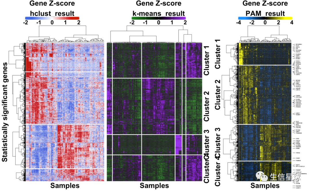
三者使用同样的基因名(每隔40个取一个),然后结果的对比:

最后的拼图
使用不同的配色,各自生成一个Heatmap对象,然后设置一个页面,分别画出这些图
代码和之前类似,都是在上面一长串的基础上修改,比如配色、图例位置等等,
注意点一:
如果要对列进行分割(如下面中间的图),可以使用参数column_km
注意点二:
分别得到三个Heatmap对象(如上面的hmap对象),然后设置页面布局
# 表示画板是一行三列
pushViewport(viewport(layout = grid.layout(nr = 1, nc = 3)))
# 第1列的图
pushViewport(viewport(layout.pos.row = 1, layout.pos.col = 1))
draw(hmap1,
     heatmap_legend_side = 'top',
     row_sub_title_side = 'left',
     newpage = FALSE)
popViewport()
# 第2列的图
pushViewport(viewport(layout.pos.row = 1, layout.pos.col = 2))
draw(hmap2,
     heatmap_legend_side = 'top',
     row_sub_title_side = 'right',
     newpage = FALSE) # 在原有画板上继续画,而不是弹出一个新窗口
popViewport()
# 第3列的图
pushViewport(viewport(layout.pos.row = 1, layout.pos.col = 3))
draw(hmap3,
     heatmap_legend_side = 'top',
     row_sub_title_side = 'right',
     newpage = FALSE)
popViewport()