scRNA-单细胞转录组学习笔记-9
刘小泽写于19.7.5 笔记目的:根据生信技能树的单细胞转录组课程探索smart-seq2技术相关的分析技术 课程链接在:http://jm.grazy.cn/index/mulitcourse/detail.html?cid=53 第二单元第七讲:统计细胞检测的基因数量
前言
原文中根据5个指标对细胞进行过滤,其中第四个是利用有表达量的基因数量进行过滤
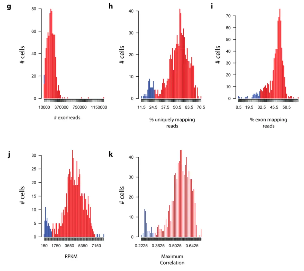
(g) number of exon mapping reads. Cutoff: 10000 (8 cells failed). (h) Percentage of uniquely mapping reads. Cutoff: 26.11 % (56 cells failed). (i) percentage of exon mapping reads. Cutoff: 31.15% (40 cells failed). (j) Number of genes with reads per kilobase gene model and million mappable reads (RPKM)>1. Cutoff: 1112.76 and 7023 (56 cells failed). (k) Maximum correlation of each cell to all other cells. Cutoff: 0.34 (54 cells failed).
但是要过滤就要有个基础,也就是有表达量的基因数量
之前在单细胞转录组学习笔记-5:https://www.jianshu.com/p/33a7eb26bd31中提到过
# 这里检测每个样本中有多少基因是表达的,count值以1为标准,rpkm值可以用0为标准
n_g = apply(a,2,function(x) sum(x>1))
这里主要是重复文章的一个小提琴图,目的是检测细胞中可以表达的基因数量:
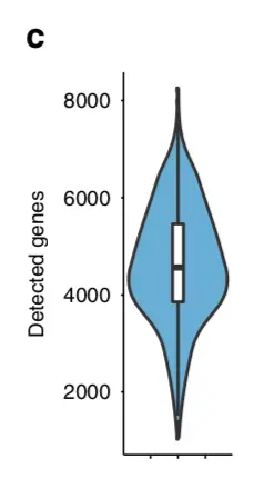
先分析一下:横坐标没有说明,图中也没有分组,因此原文是将全部的基因都画在了一起,于是之前构建的样本meta信息中的all这一列就用上了
实际操作
原文使用的是RPKM值
rm(list = ls())
options(stringsAsFactors = F)
load(file = '../input_rpkm.Rdata')
# 以下是检查数据
dat[1:4,1:4]
> head(metadata)
               g plate  n_g all
SS2_15_0048_A3 1  0048 3065 all
SS2_15_0048_A6 2  0048 3036 all
SS2_15_0048_A5 1  0048 3742 all
SS2_15_0048_A4 3  0048 5012 all
SS2_15_0048_A1 1  0048 5126 all
SS2_15_0048_A2 3  0048 5692 all
就根据这个metadata就可以作图了,步骤就是先锁定对象(这里的metadata数据框),然后做映射(y轴用n_g,x轴用all)
先画第一张图
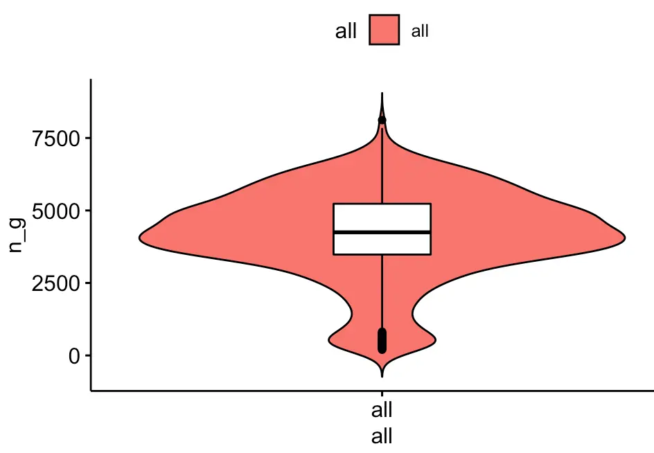
library(ggpubr)
ggviolin(metadata, x = "all", y = "n_g", fill = "all",
         add = "boxplot", add.params = list(fill = "white"))
然后可以考虑看下批次之间比较
ggviolin(metadata, x = "plate", y = "n_g", fill = "plate",
         palette = c("#00AFBB", "#E7B800", "#FC4E07"),
         add = "boxplot", add.params = list(fill = "white"))

另外还有hclust分组间比较
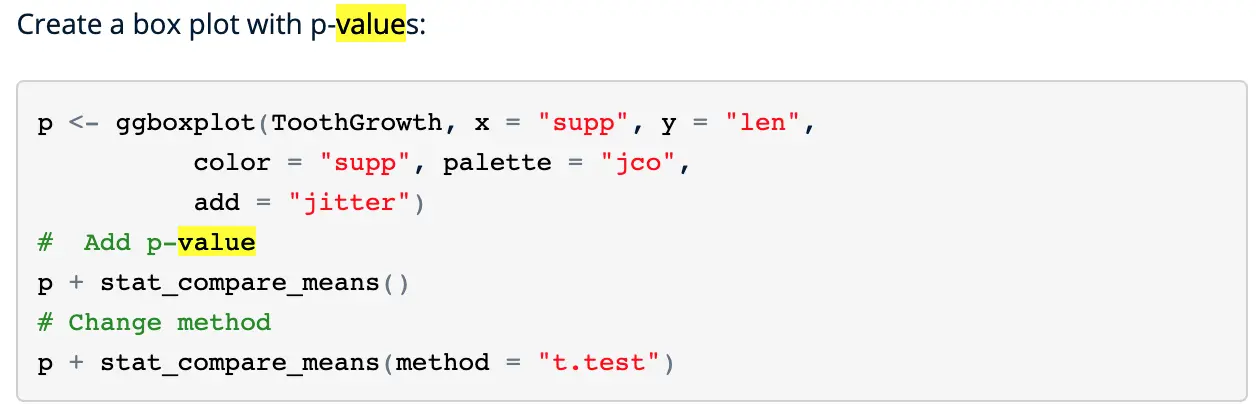
在上图的基础上还可以加上p-value,参考STHDA网站,http://www.sthda.com/english/articles/24-ggpubr-publication-ready-plots/76-add-p-values-and-significance-levels-to-ggplots/
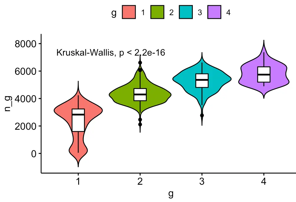
ggviolin(metadata, x = "g", y = "n_g", fill = "g",
         add = "boxplot", add.params = list(fill = "white"))  + stat_compare_means()

可以看到差异极显著
对比一下原始count矩阵得到的hclust分组结果:
rm(list = ls())
options(stringsAsFactors = F)
load(file = '../input.Rdata')
ggviolin(df, x = "g", y = "n_g", fill = "g",
         add = "boxplot", add.params = list(fill = "white"))  + stat_compare_means()
当然,还可以实现两两比较,想比较谁就比较谁:
# 只需要之前构建一个比较组合
my_comparisons <- list( c("1", "2"), c("2", "3"), c("3", "4") )
ggviolin(df, x = "g", y = "n_g", fill = "g",
         add = "boxplot", add.params = list(fill = "white"))  + stat_compare_means(comparisons = my_comparisons)+ # Add pairwise comparisons p-value
  stat_compare_means(label.y = 50)     # Add global p-value
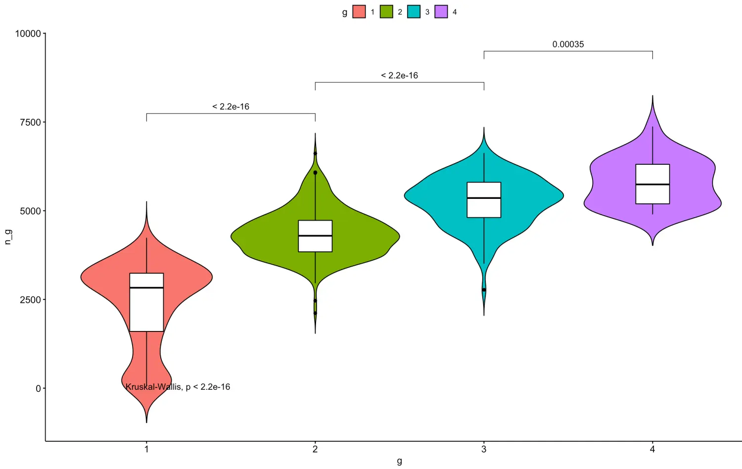
**小tip:**如果说可视化分群结果,发现群组间基因数量差异太大,就要考虑技术差异问题,因为由于生物学导致几千个基因关闭的可能性不是很大,可以换一种聚类算法试一试 目前单细胞也有很多采用dbscan算法进行的聚类分析,后续会介绍