scRNA-小鼠发育学习笔记-5-发育谱系推断及可视化
刘小泽写于19.10.24 笔记目的:根据生信技能树的单细胞转录组课程探索Smartseq2技术及发育相关的分析 课程链接在:http://jm.grazy.cn/index/mulitcourse/detail.html?cid=55 这次会介绍如何利用diffusion-map和Slingshot进行发育谱系推断,并结合作者包装的代码进行可视化。对应视频第三单元12-13讲
前言
细胞的变化是连续性的,它们从一个时间到另一个时间的变化轨迹是非常需要了解的,这也就是为何谱系推断这么重要的原因。
有了表达矩阵、高变化基因、分群信息和发育时期信息,就能进行谱系推断,有很多方法可以构建发育谱系,比如DiffusionMap、Slingshot
1 进行DiffusionMap
1.1 准备表达矩阵、HVGs、分群信息
# 表达矩阵
load('../female_rpkm.Rdata')
dim(females)

# HVGs
load('../step1-female-RPKM-tSNE/females_hvg_matrix.Rdata')
dim(females_data)

# 6个发育时期获取
head(colnames(females))
female_stages <- sapply(strsplit(colnames(females), "_"), `[`, 1)
names(female_stages) <- colnames(females)
table(female_stages)

# 4个cluster获取
cluster <- read.csv('../step1-female-RPKM-tSNE/female_clustering.csv')
female_clustering=cluster[,2];names(female_clustering)=cluster[,1]
table(female_clustering)
1.2 进行DiffusionMap
包装的代码很简单
female_dm <- run_diffMap(
  females_data,
  female_clustering,
  sigma=15
)
# 这个包装的函数其实做了下面几行代码的事情
data=females_data
condition=female_clustering
sigma=15
destinyObj <- as.ExpressionSet(as.data.frame(t(data)))
destinyObj$condition <- factor(condition)
dm <- DiffusionMap(destinyObj, sigma, rotate = TRUE)

save(female_dm,females_data,female_clustering,female_stages,
     file = 'diffusionMap_output.Rdata')
1.3 作图探索
画出特征值,这个很像PCA的碎石图screeplots或者elbowplot,也是看拐点
plot_eigenVal(
  dm=female_dm
)

# 探索4个分群
female_clusterPalette <- c(
C1="#560047",
C2="#a53bad",
C3="#eb6bac",
C4="#ffa8a0"
)
plot_dm_3D(
dm=female_dm,
dc=c(1:3),
condition=female_clustering,
colour=female_clusterPalette
)
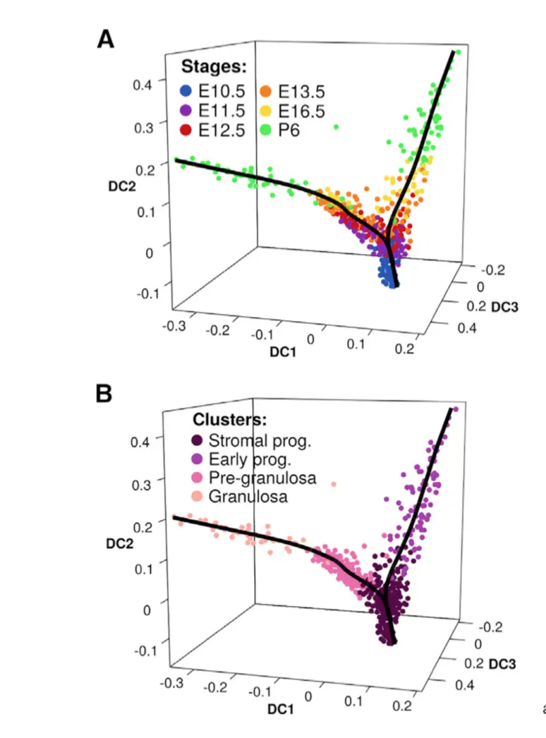
# 探索6个发育时间
female_stagePalette=c(
E10.5="#2754b5",
E11.5="#8a00b0",
E12.5="#d20e0f",
E13.5="#f77f05",
E16.5="#f9db21",
P6="#43f14b"
)
plot_dm_3D(
dm=female_dm,
dc=c(1:3),
condition=female_stages,
colour=female_stagePalette
)
可以看到,这个函数主要就是选取了前3个DC成分,做了三维空间的映射,然后把点的颜色分别按照cluster和stage两种不同的属性上色
2 进行Slingshot
将会利用前面DiffusionMap的结果
看上面的plot_eigenVal结果,看到DC4处是一个拐点,于是可以认为前4个DC是重要的
dm=female_dm
dim=c(1:4)
condition=factor(female_clustering)

data <- data.frame(
  dm@eigenvectors[,dim]
)

female_lineage <- slingshot(
  data,
  condition,
  start.clus = "C1",
  end.clus=c("C2", "C4"),
  maxit=100000,
  shrink.method="cosine"
  # shrink.method="tricube"
)
# 看下结果
> female_lineage
class: SlingshotDataSet

 Samples Dimensions
     563          4

lineages: 2
Lineage1: C1  C3  C4
Lineage2: C1  C2

curves: 2
Curve1: Length: 1.3739	Samples: 453.62
Curve2: Length: 0.74646	Samples: 312.73
它推断的细胞发育谱系结果在:
female_pseudotime <- get_pseudotime(female_lineage, wthres=0.9)
rownames(female_pseudotime) <- colnames(females)
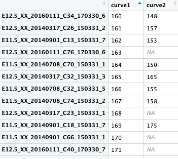
从这个结果可以看出:行名是细胞,curve1是第一条推断的发育轨迹,curve2是第二条;每个细胞在不同轨迹中所处的位置不同,并且有的细胞只在第一条轨迹中存在,在第二条中就是NA
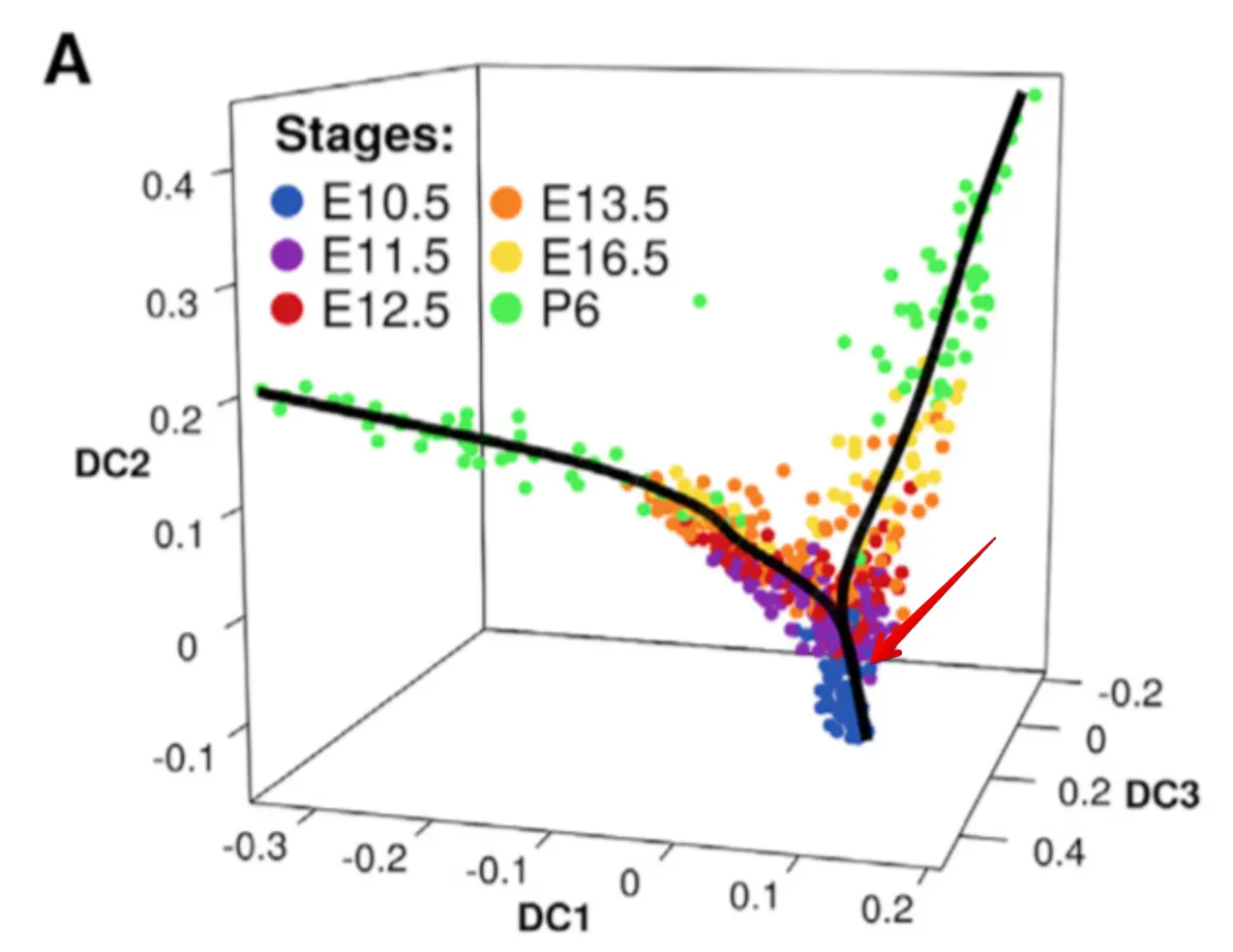
再回来看这个发育轨迹图,
最初是由E10.5作为起点发育的,然后分化成两个方向
看到P6这个时期是在两条轨迹中都存在的,说明这个时期的细胞存在异质性。也就是说,虽然都是P6时期取的细胞,但是它们实际的发育方向是不用的
这个算法就是帮助我们认识到不同时期内部的各个细胞,它们依然还存在着差异
小结
构建发育谱系,先走一下DiffusionMap的流程,得到几个重要的DC;接着走一下Slingshot函数,就会得到谱系结果
3 谱系发育相关基因可视化
最初我们知道细胞有6个时期(就是取样的6个时间点);然后进行聚类发现这些细胞能分成4个cluster(意思就是虽然是一个时间点取的细胞,依然可能属于不同类型);后来进行谱系推断,又增加了一个细胞属性(就是2条不同的发育轨迹)
3.1 载入之前结果
rm(list = ls())
options(warn=-1)
options(stringsAsFactors = F)
source("../analysis_functions.R")

load('../female_rpkm.Rdata')
load(file = 'step4.1-diffusionMap_output.Rdata')
load(file = 'step4.2-female_pseudotime.Rdata')
3.2 对谱系推断结果进行归一化
目的就是让两条轨迹可以比较,采用的方法就是每条轨迹的每个值分别除以各自的最大值
## 第一条
pseudotime_lin <- female_pseudotime[,"curve1"]
max_pseudotime <- max(pseudotime_lin, na.rm = TRUE)
pseudotime_lin1_percent <- (pseudotime_lin*100)/max_pseudotime
## 第二条
pseudotime_lin <- female_pseudotime[,"curve2"]
max_pseudotime <- max(pseudotime_lin, na.rm = TRUE)
pseudotime_lin2_percent <- (pseudotime_lin*100)/max_pseudotime
# 现在female_pseudotime中的两条轨迹结果都在0-100之间了
female_pseudotime[,"curve1"] <- pseudotime_lin1_percent
female_pseudotime[,"curve2"] <- pseudotime_lin2_percent
不同于stage和cluster两种细胞属性,这个发育谱系属性是连续型的 。既然细胞是按照一定顺序排列的,那么就会有一些基因表达量会跟着这个连续变量进行变化
这也正是单细胞数据的优势所在,过去只有离散型的分类变量,因此只能先通过差异分析得到结果,然后对结果去注释。
3.3 可视化
将感兴趣的基因在感兴趣的谱系中进行展示
作者包装的代码非常复杂,一个包装好的函数就有140多行代码
## 先给一个颜色
# 6个stage颜色
female_stagePalette <- c(
  E10.5="#2754b5",
  E11.5="#8a00b0",
  E12.5="#d20e0f",
  E13.5="#f77f05",
  E16.5="#f9db21",
  P6="#43f14b"
)
# 4个cluster颜色
female_clusterPalette <- c(
  C1="#560047",
  C2="#a53bad",
  C3="#eb6bac",
  C4="#ffa8a0"
)
# 2个发育谱系颜色
female_clusterPalette2 <- c(
  "#ff6663",
  "#3b3561"
)

## 做第一个谱系的一个基因(以Amhr2基因为例)
plot_smoothed_gene_per_lineage(
  rpkm_matrix=females, # RPKM表达矩阵
  pseudotime=female_pseudotime,  #谱系推断结果
  lin=c(1), # 对第一个谱系操作
  gene="Amhr2",  #画Amhr2基因变化
  stages=female_stages, # 发育时间点分类
  clusters=female_clustering, # cluster分类
  stage_colors=female_stagePalette,
  cluster_colors=female_clusterPalette,
  lineage_colors=female_clusterPalette2
)
从得到的图可以看出,这个加入了散点geom_point、平滑线geom_smooth、地毯线等等
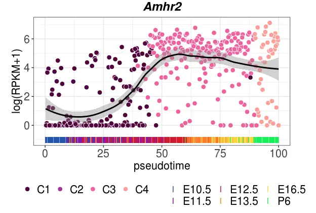
# 做某个基因在两个谱系中的变化(以Amhr2基因为例)
plot_smoothed_gene_per_lineage(
  rpkm_matrix=females,
  pseudotime=female_pseudotime,
  lin=c(1,2),
  gene="Amhr2",
  stages=female_stages,
  clusters=female_clustering,
  stage_colors=female_stagePalette,
  cluster_colors=female_clusterPalette,
  lineage_colors=female_clusterPalette2
)
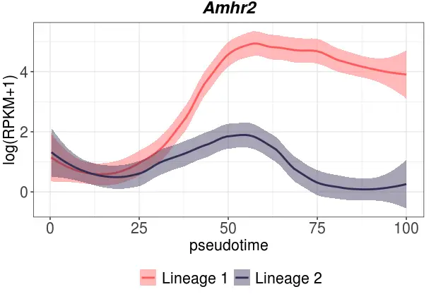
看到这个Amhr2基因在第一个谱系中变化很大,尤其是到后期;而在第二个谱系中基本保持平衡,这就说明这个基因就是第一个谱系中重要的基因
最后就是对多个基因批量作图
gene_list <- c(
  "Sall4",
  "Sox11",
  "Gata4",
  "Lgr5",
  "Runx1",
  "Foxl2",
  "Hey2",
  "Wnt5a",
  "Pdgfra",
  "Nr2f2",
)

plot_smoothed_genes <- function(genes, lin){
  female_clusterPalette2 <- c("#ff6663", "#3b3561")
  for (gene in genes){
    plot_smoothed_gene_per_lineage(
      rpkm_matrix=females,
      pseudotime=female_pseudotime,
      lin=lin,
      gene=gene,
      stages=female_stages,
      clusters=female_clustering,
      stage_colors=female_stagePalette,
      cluster_colors=female_clusterPalette,
      lineage_colors=female_clusterPalette2
    )
  }
}

pdf("interesting_genes_in_lineage.pdf", width=4, height=4)
plot_smoothed_genes(gene_list, 1) # plot only lineage 1
plot_smoothed_genes(gene_list, 2) # plot only lineage 2
plot_smoothed_genes(gene_list, c(1,2)) # plot the two moleages in the same graph to see the divergence
dev.off()