240-自己如何画气泡图dotplot?
刘小泽写于2021.4.14 看到David McGaughey写了一篇博客:http://davemcg.github.io/post/lets-plot-scrna-dotplots/,他介绍了一些关于dotplot的事情。拿来学习一下
看完这篇,从出图到美观
首先,什么是气泡图dotplot?
比如 来自文章(https://www.sciencedirect.com/science/article/pii/S0092867419300376)的这个G图就是dotplot
它和heatmap类似,要么行是基因,列是样本;要么行是样本,列是基因,并且还支持聚类。主要用于体现不同组之间的基因差异。
可以认为dotplot是heatmap的升级版,heatmap可以认为每一个样本的每一个基因,在图上是方块,可以用颜色来表示表达量高低;但是**dotplot除了可以用颜色表示表达量高低以外,还能通过点(或者说“气泡”)的大小,来表示某个样本中的细胞数量/比例。**例如:如果说某个样本中有更多的细胞表达了这个基因,那么这个位置就会形状更大,颜色更深。
上面说到,它可以反映某个样本中的细胞数量多少,因此在单细胞数据分析中经常出现。
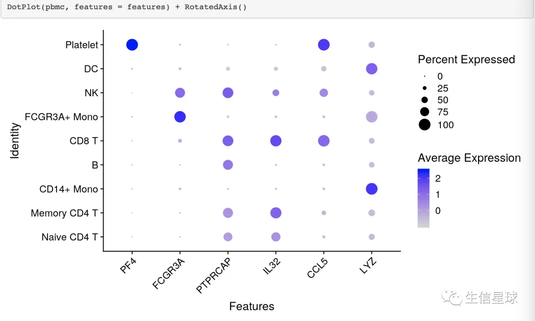
例如在Seurat中:https://satijalab.org/seurat/archive/v3.0/visualization_vignette.html
开始DIY
准备数据
library(tidyverse)
library(ggdendro)
library(cowplot)
library(ggtree)
library(patchwork)

gene_cluster <- read_tsv('https://github.com/davemcg/davemcg.github.io/raw/master/content/post/scRNA_dotplot_data.tsv.gz')

gene_cluster %>% sample_n(5)
## # A tibble: 5 x 6
##   Gene    cluster cell_ct cell_exp_ct    count Group
##   <chr>   <chr>     <dbl>       <dbl>    <dbl> <chr>
## 1 MYH11   c22         278           9 0.0324   Fibroblast
## 2 CARM1   c19         922           8 0.00868  Astrocyte
## 3 MICA    c11        1870          22 0.0118   Astrocyte
## 4 SLC39A3 c02        3320           3 0.000904 Fibroblast
## 5 DVL3    c20         336         254 1.30     Neuron
cluster是scRNA中的clustercell_ct是cluster中的细胞数量cell_exp_ct是该cluster中检测到该基因的细胞数量count是基因的mean log2表达量Group是cluster属于的细胞类型
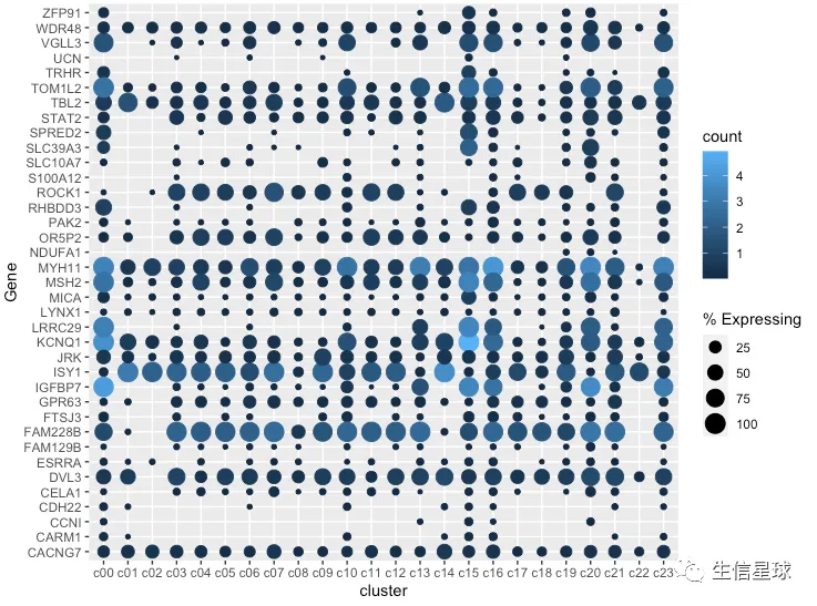
最简单的作图
把cluster中存在基因表达的细胞数量百分比做出来,就可以展示为气泡的大小
gene_cluster %>% filter(Gene %in% markers) %>%
    mutate(`% Expressing` = (cell_exp_ct/cell_ct) * 100) %>%
    ggplot(aes(x=cluster, y = Gene, color = count, size = `% Expressing`)) +
    geom_point()
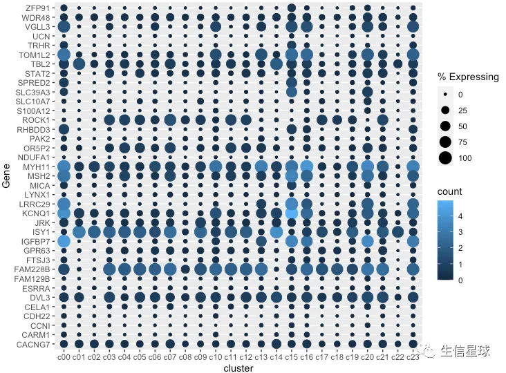
看到很多气泡为0,那么就把等于0或者接近0的气泡删掉
gene_cluster %>% filter(Gene %in% markers) %>%
    mutate(`% Expressing` = (cell_exp_ct/cell_ct) * 100) %>%
    filter(count > 0, `% Expressing` > 1) %>%
    ggplot(aes(x=cluster, y = Gene, color = count, size = `% Expressing`)) +
    geom_point()
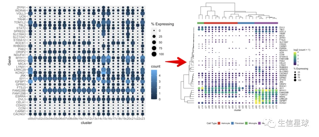
修改颜色、主题、坐标轴
gene_cluster %>% filter(Gene %in% markers) %>%
  mutate(`% Expressing` = (cell_exp_ct/cell_ct) * 100) %>%
  filter(count > 0, `% Expressing` > 1) %>%
  ggplot(aes(x=cluster, y = Gene, color = count, size = `% Expressing`)) +
  geom_point() +
  scale_color_viridis_c(name = 'log2 (count + 1)') +
  cowplot::theme_cowplot() +
  theme(axis.line  = element_blank()) +
  theme(axis.text.x = element_text(angle = 90, vjust = 0.5, hjust=1)) +
  ylab('') +
  theme(axis.ticks = element_blank())

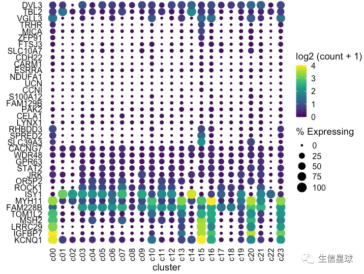
看到存在某个基因表达量很高,影响了其他基因的展示 例如中间颜色最黄的那个(KCNQ1),那索性就把它作为颜色的最大值好了(比如这里的4)
设置图例颜色的范围
使用scale_color_gradientn设置渐变色的范围为0-4,如果有的点超过了4,那么通过oob = scales::squish将它硬生生压到4
dotplot <- gene_cluster %>% filter(Gene %in% markers) %>%
  mutate(`% Expressing` = (cell_exp_ct/cell_ct) * 100) %>%
  filter(count > 0, `% Expressing` > 1) %>%
  ggplot(aes(x=cluster, y = Gene, color = count, size = `% Expressing`)) +
  geom_point() +
  cowplot::theme_cowplot() +
  theme(axis.line  = element_blank()) +
  theme(axis.text.x = element_text(angle = 90, vjust = 0.5, hjust=1)) +
  ylab('') +
  theme(axis.ticks = element_blank()) +
  scale_color_gradientn(colours = viridis::viridis(20), limits = c(0,4), oob = scales::squish, name = 'log2 (count + 1)')

dotplot
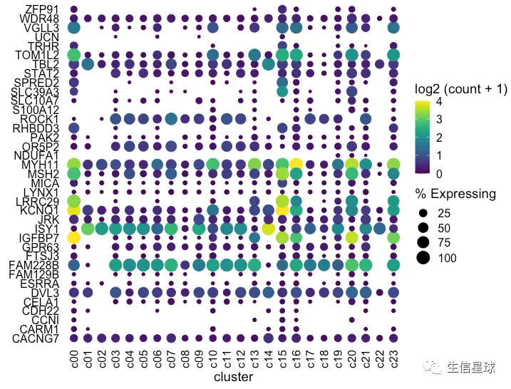
看上去,比最初好看了许多。这时我们已经调整完了表达量、数量,不过还有聚类可以再加上去
ggplot没有内置聚类树,但可以有以下几个选择:
- 直接用
hclust对基因进行聚类:mutate(Gene = factor(Gene, levels = YOURNEWGENEORDER),然后做的图中基因的排序就会是聚类之后的顺序,但是图中不会出现聚类树 - 使用
ComplexHeatmap,但过程有些复杂 - 使用
ggtree:我们下面就看看这个方法
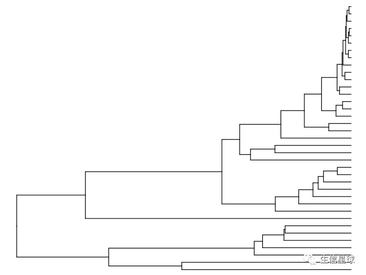
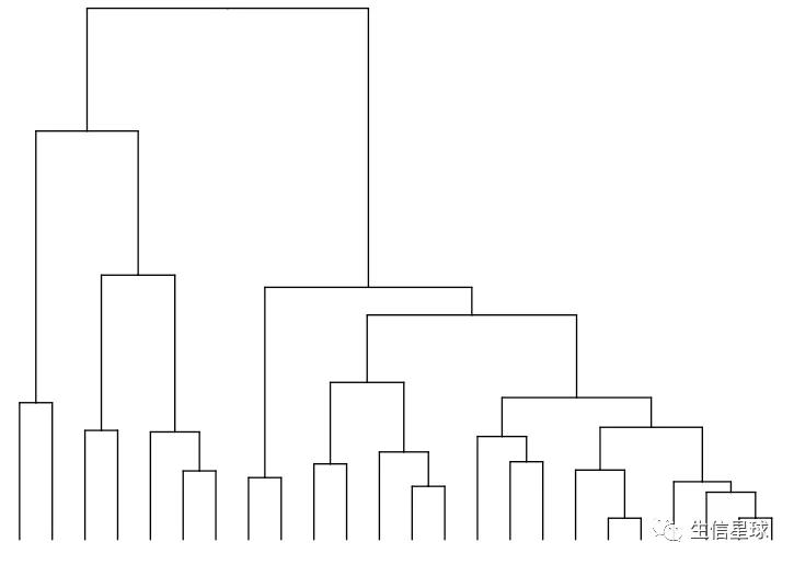
先用ggtree 单独画一个聚类树
# devtools::install_github("YuLab-SMU/ggtree")
# 首先将数据变成数据框,行为基因,列为样本
mat <- gene_cluster %>%
    filter(Gene %in% markers) %>%
    select(-cell_ct, -cell_exp_ct, -Group) %>%  # drop unused columns to faciliate widening
    pivot_wider(names_from = cluster, values_from = count) %>%
    data.frame() # make df as tibbles -> matrix annoying
row.names(mat) <- mat$Gene
mat <- mat[,-1]

> mat[1:4,1:4]
              c00         c01         c02         c03
MICA   0.28905878 0.023216308 0.035417157 0.032588291
ESRRA  0.04856985 0.015737532 0.020356916 0.008599147
CARM1  0.08822628 0.011939390 0.002409639 0.006500512
IGFBP7 4.26602825 0.001864372 0.002409639 0.081627805

# 然后转为矩阵后用dist默认方法(欧氏距离),再进行hclust
clust <- hclust(dist(mat %>% as.matrix()))


ddgram <- as.dendrogram(clust)
# create dendrogram (如果这里报错,可能是R版本太低,用4.0以上是正常的)
ggtree_plot <- ggtree::ggtree(ddgram)
ggtree_plot
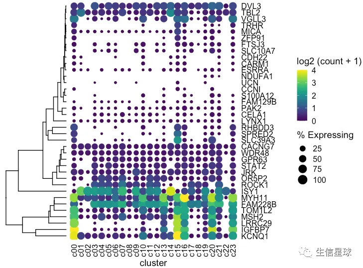
然后把聚类树和之前的图用cowplot粘起来
plot_grid(ggtree_plot, dotplot, nrow = 1, rel_widths = c(0.5,2), align = 'h')
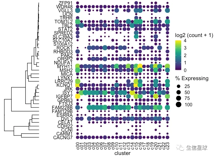
出现一个问题:我们这里的聚类树,是真实的基因聚类吗? 看到这里的基因排序并没有改变,只是被我们硬生生和聚类树粘在了一起
如何调整基因的顺序
# 拿到聚类后的基因顺序,然后变成因子
> clust$labels[clust$order]
 [1] "KCNQ1"   "IGFBP7"  "LRRC29"  "MSH2"    "TOM1L2"  "FAM228B" "MYH11"   "ISY1"    "ROCK1"   "OR5P2"   "JRK"
[12] "STAT2"   "GPR63"   "WDR48"   "CACNG7"  "SLC39A3" "SPRED2"  "RHBDD3"  "LYNX1"   "CELA1"   "PAK2"    "FAM129B"
[23] "S100A12" "CCNI"    "UCN"     "NDUFA1"  "ESRRA"   "CARM1"   "CDH22"   "SLC10A7" "FTSJ3"   "ZFP91"   "MICA"
[34] "TRHR"    "VGLL3"   "TBL2"    "DVL3"

dotplot <- gene_cluster %>% filter(Gene %in% markers) %>%
  mutate(`% Expressing` = (cell_exp_ct/cell_ct) * 100,
         Gene = factor(Gene, levels = clust$labels[clust$order])) %>%
  #filter(count > 0, `% Expressing` > 1) %>%
  ggplot(aes(x=cluster, y = Gene, color = count, size = `% Expressing`)) +
  geom_point() +
  cowplot::theme_cowplot() +
  theme(axis.line  = element_blank()) +
  theme(axis.text.x = element_text(angle = 90, vjust = 0.5, hjust=1)) +
  ylab('') +
  theme(axis.ticks = element_blank()) +
  scale_color_gradientn(colours = viridis::viridis(20), limits = c(0,4), oob = scales::squish, name = 'log2 (count + 1)')

dotplot
这才是真实的聚类以后的结果,才能继续和聚类树粘在一起
如何将聚类树和气泡图之间的空白区域减少?
可以把基因ID移到右侧:scale_y_discrete(position = "right")
dotplot <- gene_cluster %>% filter(Gene %in% markers) %>%
  mutate(`% Expressing` = (cell_exp_ct/cell_ct) * 100,
         Gene = factor(Gene, levels = clust$labels[clust$order])) %>%
  filter(count > 0, `% Expressing` > 1) %>%
  ggplot(aes(x=cluster, y = Gene, color = count, size = `% Expressing`)) +
  geom_point() +
  cowplot::theme_cowplot() +
  theme(axis.line  = element_blank()) +
  theme(axis.text.x = element_text(angle = 90, vjust = 0.5, hjust=1)) +
  ylab('') +
  theme(axis.ticks = element_blank()) +
  scale_color_gradientn(colours = viridis::viridis(20), limits = c(0,4), oob = scales::squish, name = 'log2 (count + 1)') +
  scale_y_discrete(position = "right")
#################################################

plot_grid(ggtree_plot, NULL, dotplot, nrow = 1, rel_widths = c(0.5,-0.05, 2), align = 'h')
然后我们继续对列(样本)进行聚类
和之前hclust代码类似,只是这里在hclust的时候,需要转置一下
mat <- gene_cluster %>%
    filter(Gene %in% markers) %>%
    select(-cell_ct, -cell_exp_ct, -Group) %>%
    pivot_wider(names_from = cluster, values_from = count) %>%
    data.frame()
row.names(mat) <- mat$Gene
mat <- mat[,-1]

v_clust <- hclust(dist(mat %>% as.matrix() %>% t()))  #加一个转置,对列进行计算

ddgram_col <- as.dendrogram(v_clust)
ggtree_plot_col <- ggtree(ddgram_col) + layout_dendrogram()
ggtree_plot_col
然后,就是把各个部分粘在一起
一个重点就是:如何将每个部分对齐?
使用aplot::xlim2 以及 aplot::ylim2 ,将主图(气泡图)分别与样本的聚类树、基因的聚类树对齐
xlim2 : set axis limits of a ‘ggplot’ object based on the x limits of another ‘ggplot’ object
需要注意,现在
xlim2和ylim2已经不在ggtree中了,迁移到了aplot中

remotes::install_github("YuLab-SMU/aplot")
代码实现:
ggtree_plot_col <- ggtree_plot_col + xlim2(dotplot)
ggtree_plot <- ggtree_plot + ylim2(dotplot)
样本的注释信息可以加进来
这里的数据中:各个cluster属于哪个细胞类型,就是样本的注释信息
同样使用xlim2保证和主图的x轴(即样本)对齐
labels <- ggplot(gene_cluster %>%
                     mutate(`Cell Type` = Group,
                            cluster = factor(cluster, levels = v_clust$labels[v_clust$order])),
                 aes(x = cluster, y = 1, fill = `Cell Type`)) +
    geom_tile() +
    scale_fill_brewer(palette = 'Set1') +
    theme_nothing() +
    xlim2(dotplot)

# 一直保留在底部
legend <- plot_grid(get_legend(labels + theme(legend.position="bottom")))
最后,就是全部画在一起
这个过程,估计要反复修改
首先看到是这样的:除了底部的legend,一共有3列,5行
plot_spacer() + plot_spacer() + ggtree_plot_col +
    plot_spacer() + plot_spacer() + labels +
    plot_spacer() + plot_spacer() + plot_spacer() +
    ggtree_plot + plot_spacer() + dotplot +
    plot_spacer() + plot_spacer() + legend +
    plot_layout(ncol = 3)

然后就是要调整3列的宽度
plot_spacer() + plot_spacer() + ggtree_plot_col +
    plot_spacer() + plot_spacer() + labels +
    plot_spacer() + plot_spacer() + plot_spacer() +
    ggtree_plot + plot_spacer() + dotplot +
    plot_spacer() + plot_spacer() + legend +
    plot_layout(ncol = 3,widths = c(0.7, -0.1, 4))
再调整每一行的高度
plot_spacer() + plot_spacer() + ggtree_plot_col +
    plot_spacer() + plot_spacer() + labels +
    plot_spacer() + plot_spacer() + plot_spacer() +
    ggtree_plot + plot_spacer() + dotplot +
    plot_spacer() + plot_spacer() + legend +
    plot_layout(ncol = 3,widths = c(0.7, -0.1, 4),heights = c(0.9, 0.1, -0.1, 4, 1))

当然,如果配色方案不合胃口,看花花推荐的2k+颜色模板: 迄今为止最优秀的配色R包